
FWD Life Insurance
2023 to 2026
FWD Life Insurance came in with a bold promise: "Changing the way people feel about insurance". As one of the youngest insurance brands in the Philippines, The company went digital-first and customer-led at a time when most insurers were still knocking on doors. In just over 10 years, that bet paid off. It became one of the top insurers in the country, and I'm proud to have been part of that journey.
FinTech and Insurance
Branding
UI/UX

FWD Life Insurance Philippines - Customer Experience & Marketing Team
Company: FWD Life Insurance Philippines
Role: UI/UX Design, Manager
Industry: insurance
THE CHALLENGE
Before I joined, FWD Philippines relied on third-party vendors for UI and UX, which meant inconsistencies across every digital touchpoint and no single source of truth to build on. My job was to change that by building the design foundation from scratch, introducing the right tools and processes, and helping the team understand how good design directly connects to better customer experiences. It wasn't a small ask, but it was exactly the kind of challenge worth showing up for.
THE OPPORTUNITY
Starting from zero meant full creative ownership and the freedom to do things right. I had the chance to pioneer FWD's design practice, bring industry-standard processes to the team, and collaborate across pan-Asian markets to create work that was consistent, scalable, and genuinely customer-led.
THE SOLUTION
The first step was understanding what already existed before redesigning anything. I dug into the data, studied the current website, online shop, and apps, and listened to what customers were actually saying. That groundwork shaped everything that followed, from building FWD's first Figma design library and educating the team on UX, to tackling bigger initiatives like unifying the corporate and shop experience into one seamless platform and making digital insurance genuinely easy to buy.
KEY PROJECTS
Changing the way people feel about insurance
FWD x GInsure, FWD One Website, & FWD Customer Portal


FWD X GINSURE
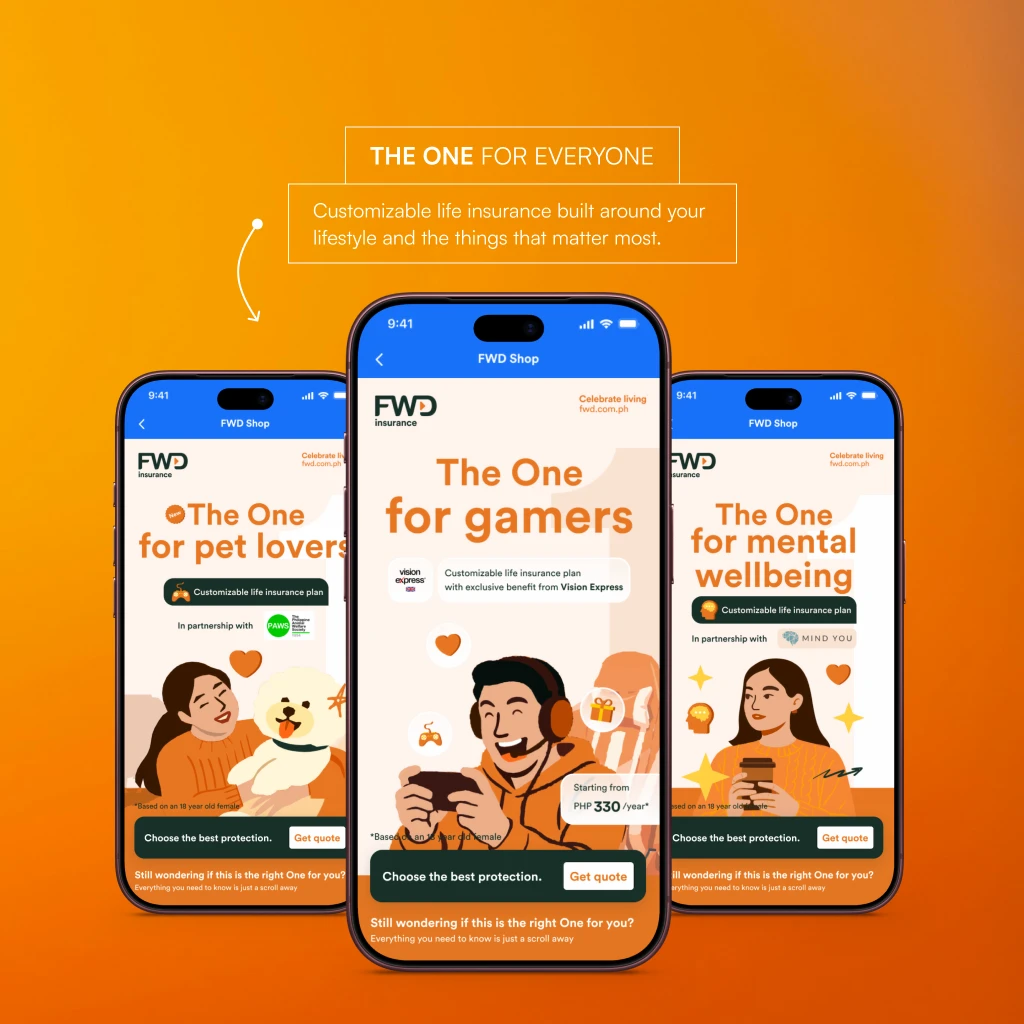
GCash has over 90 million users in the Philippines, and we saw an opportunity to meet them right where they were. I led the end-to-end design of FWD's insurance products inside the GCash ecosystem, with one clear goal: make insurance more accessible, affordable, and pocketable for first-time buyers who may have never considered it before. Every screen was designed to remove the barriers between a user and their first policy, making FWD's digital insurance feel as simple and familiar as any other transaction in the app. Because the best insurance experience is one that fits right inside your pocket.


One Website
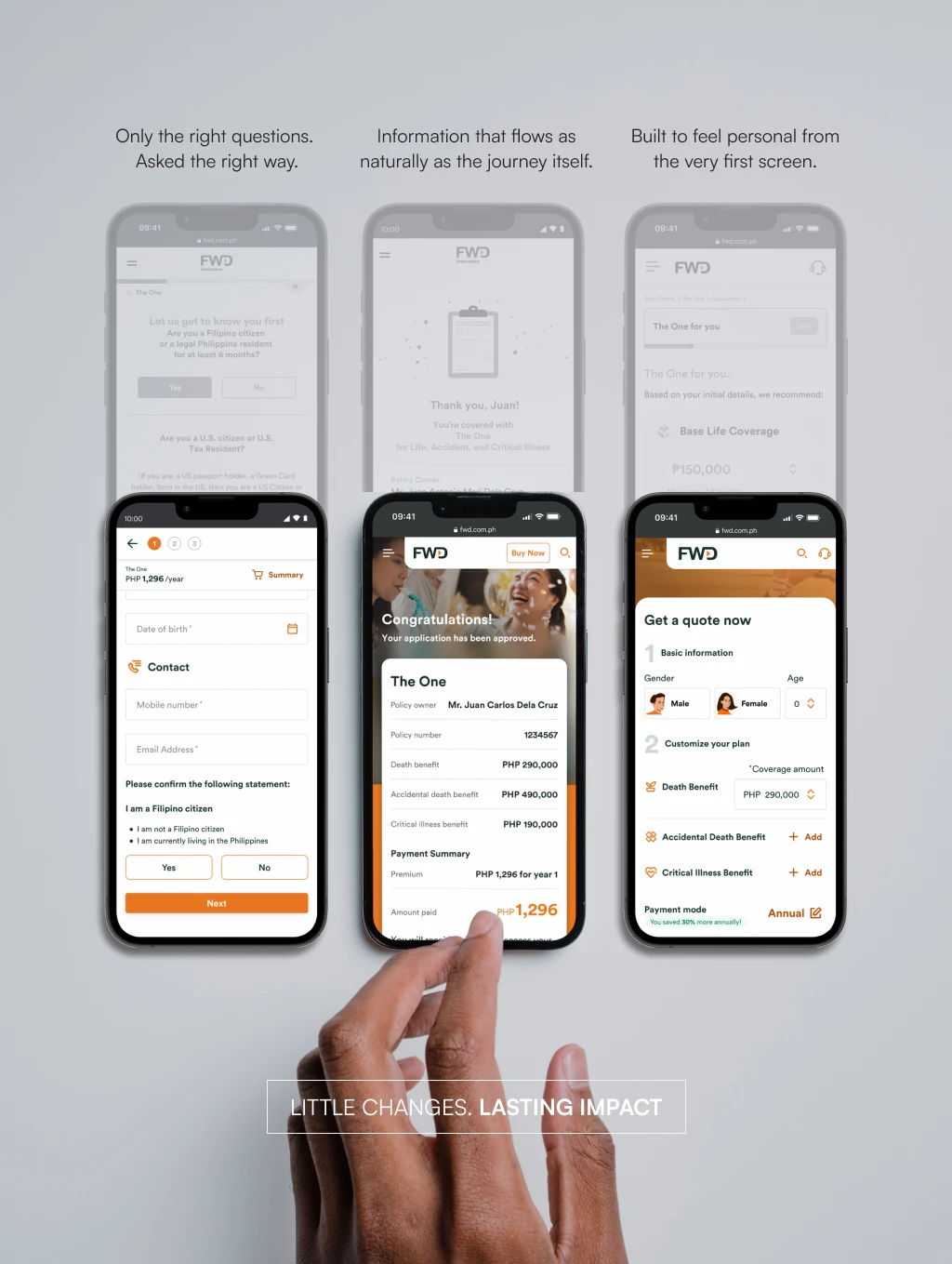
This was the project where everything came together. I led the design of FWD Philippines' website migration, unifying the corporate and shop platforms into one seamless experience while cutting the insurance buying journey from 20 minutes down to 7, a 64% reduction. We challenged the limits of the company's CMS, refreshed the visual direction to feel younger and more accessible, and improved overall site speed by 30% through smarter asset optimization. Less clicks, faster loads, and a brand that finally looked the part.



FWD Customer Portal
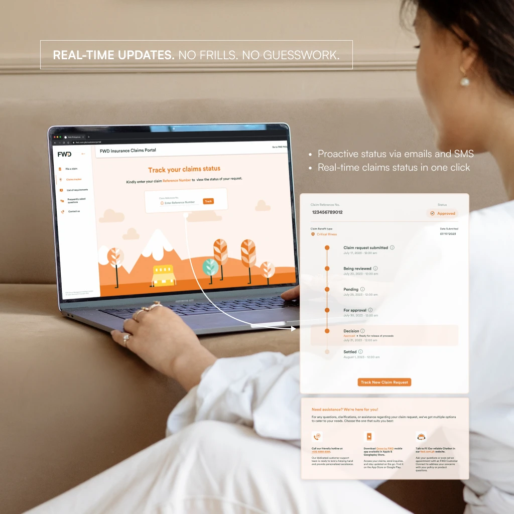
The FWD Customer Portal started as a Customer Experience initiative and became one of the most meaningful projects I worked on. Policy holders could finally submit their claims online, attach the right requirements, and track where things stood without having to chase anyone down. Simple idea. Real impact.


01
Built a scalable design library and UX practice from the ground up
I built a flexible, AI-ready design library for FWD Philippines that goes beyond product design. It also speeds up eDMs, social media cards, policy packs, decks, and motion graphics for the CX and marketing teams. Alongside it, I ran UX knowledge-transfer and Figma learning sessions, which cut UI/UX production time by 45% and pushed Figma adoption to 100%.
02
Cut the insurance purchase journey from 20 to 7 minutes
65% faster purchase journey | +30% website traffic and engagement I simplified the application journey with a Quick Quote feature, grouped related questions for clearer information architecture, and removed the unnecessary ones. Load times dropped too. Every change was backed by real user interviews and data analysis.
03
Designed a claims portal that makes filing and tracking simple
For my capstone project, I designed the FWD claims portal, where customers can file and track claims online. It also helps the operations team automate and manage the daily flow of claim requests. The goal was simple: less chasing for customers, less manual work for ops.
what i learned
No perfect system, just a solid foundation. A flexible core of components and UIs can handle almost any design curveball.
Talk to real customers. Data and feedback matter, but sitting down with users is what moves mountains for a customer-led platform.
Start with the right conversations. Early talks with customers and stakeholders helped me filter and phase every solution.
Launch is not the finish line. Design, build, measure, and optimize on repeat to keep taking the product to the next level.
What I’d Do Differently
Automate the library with Figma agents. Let the system handle the repetitive upkeep, so the team can focus on design decisions.
Vibe code early concepts. A quick, working look and feel lets stakeholders and customers react to something real before we commit to a full build.
Pilot more AI tools, then scale. Try them for discovery and knowledge-transfer sessions first, and roll them out fully once the process is proven efficient.
Grow the UX team. More hands means more time for research and more empathy in every project.


